
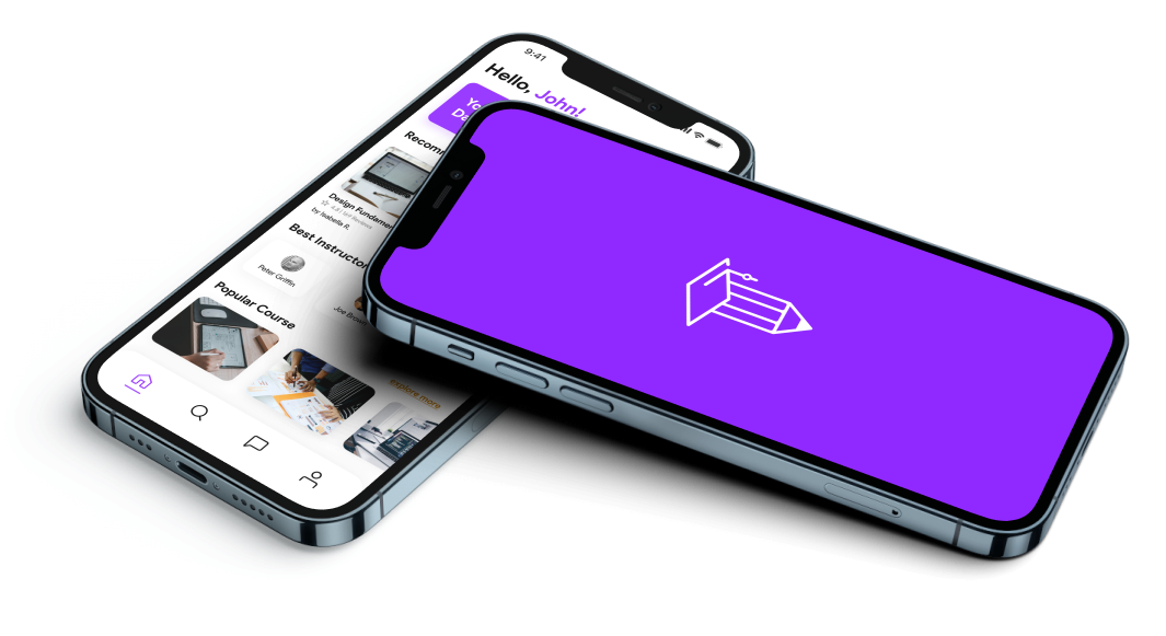
Learnly is a conceptual online education app that encourages users to complete the courses they enroll in rather than dropping out.
The study involves identifying the reasons why users drop out of online courses and developing a user-centered design solution that addresses these issues.
Solo project
Figma, Adobe Creative Suite, Google Docs
4 weeks
I carried out user interviews and did secondary research on the existing features of other prominent apps. Ideated various features to be incorporated and worked on the visual screens and prototypes.
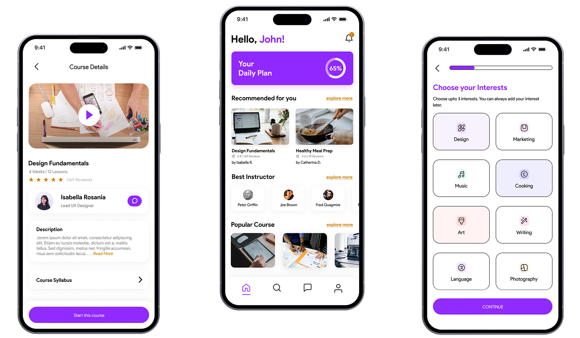
I created this conceptual app which aims to increase user engagement and completion rates of online courses.
This project also involves conducting research to identify the reasons for high dropout rates among online course users.
Based on the findings, I came up with how a user-centered design solution can help to addresses these issues.
Solution:
My design solution includes progress tracking, rewards, and a supportive learning community to keep users motivated and engaged throughout the course.
The project finally concludes with usability testing to evaluate the effectiveness of the design and ensure its success in meeting the project goals.
I have also added possible monetization strategy solution to meet business goals
Result:The end result is an online education app that offers an intuitive and engaging user experience, keeping users motivated to complete their courses.
Impact:92% user satisfaction rate (via Usability test result)
(- Education Technology Journal; Source)
Enrollment vs. Completion: Many online education apps see a lot of users signing up for courses, but not as many actually finishing them.
Struggles with Engagement: Users often find it hard to stay focused and motivated when studying online. Keeping track of progress can be a challenge.
Limited Interactivity: Most online courses lack fun and interactive elements. Learning tends to be a bit one-sided, with limited chances for students to discuss or work together.
Feeling Alone: Online learners sometimes feel isolated. They miss having a sense of community and the chance to connect with fellow learners.
Different Ways of Learning: People have different ways of learning. Online education apps need to find a balance between offering structured content and giving learners some flexibility to study in their own style.
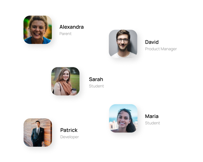
Sarah is a 20-year-old university student studying psychology at the local university. She's in her second year and has a busy schedule with lectures, assignments, and part-time work at a coffee shop. Due to this busy schedule, she priortized those work over learning on her current online education app. She needs an alternative where she is motivated to complete learning.
David is a 28-year-old product manager at a tech company. He has several years of experience in his field and is taking an online course in Figma to communicate effectively with product designers and stay up-to-date with the latest trends and strategies. However, David wants to connect with peers taking the same online course to build projects together which he can not do in the current online education app.
Let’s look at the UX challenge in more detail:
"How might we increase user engagement and course completion rates for an online education app by addressing the reasons for high dropout rates and creating a more motivating and supportive learning environment?"
In order to provide empathy to users and realize what problems they face with and what motivates them to use the education app
Asked about strengths and weaknesses of sharing applications, about pains that users met. Also the main question was how the app can help to resolve users problems
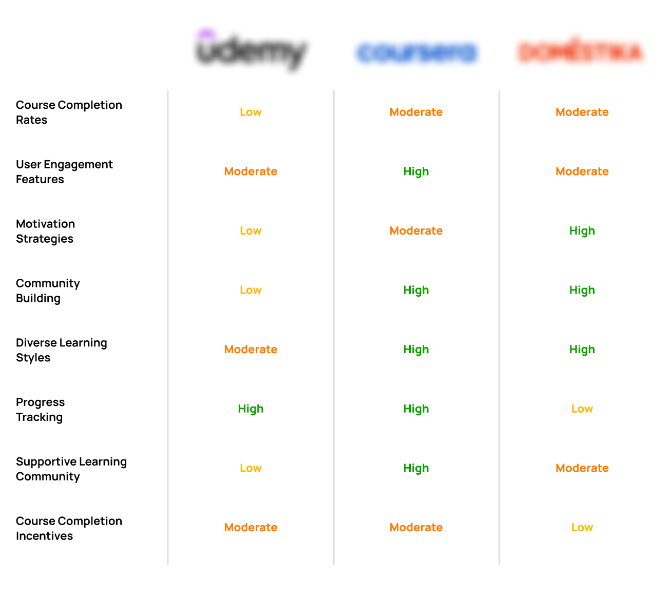
This analysis provided me a concise overview of the strengths and weaknesses of each platform across various key metrics.
By comparing their performance in these areas, I gained valuable insights into the distinct features and offerings of these platforms in the realm of online education.
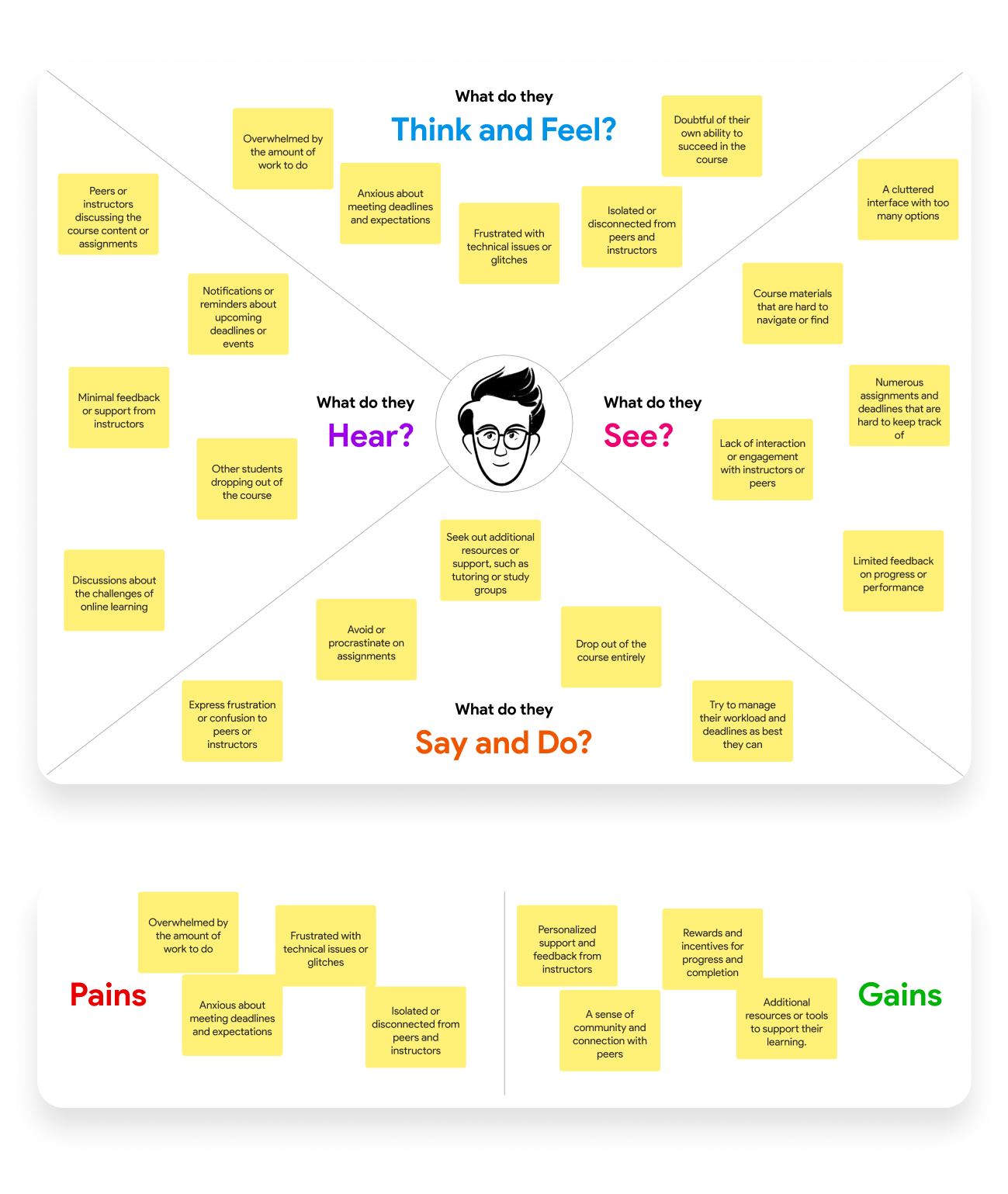
Most online education apps face a persistent issue of high dropout rates among its users, which is impacting the effectiveness of the online courses.
Many users struggle to stay engaged throughout their courses, leading to incomplete learning experiences and a decline in overall user satisfaction.
Users often lack the motivation to complete courses due to factors like a lack of clear progress tracking and meaningful rewards.
Most apps doesn't address the issue of users feeling isolated during their online learning journey, which can negatively impact their commitment to courses.
Users have limited opportunities for interaction and collaboration with peers, missing out on the benefits of a supportive learning community.
Doesn't accommodate various learning styles and preferences to cater to a wide range of users effectively.
Users struggle to track their course progress, leading to a lack of clarity about their achievements and milestones.
Ultimately, the primary problem is the low completion rates of courses, which affects the overall success and impact of the platform.
Implement a clear and intuitive progress tracking systemwithin the app, allowing users to easily monitor their course advancement.
Introduce a rewards system that acknowledges user achievements and milestones, enhancing motivation and engagement.
Create a robust community feature within the app, enabling users to interact, collaborate, and seek support from peers, thus addressing feelings of isolation.
Offer personalized course recommendations and learning paths to cater to diverse learning styles and preferences.
Establish mechanisms for regular feedback collection from users to ensure continuous improvement in the user experience.
Focus on curating and creating content that aligns with user needs and preferences, ensuring that courses are engaging and relevant.
Provide readily accessible user support channels to assist learners with any technical or content-related issues.
Adopt an iterative approach to design and regularly conduct usability testing to refine and optimize the user experience based on user feedback and behavior.
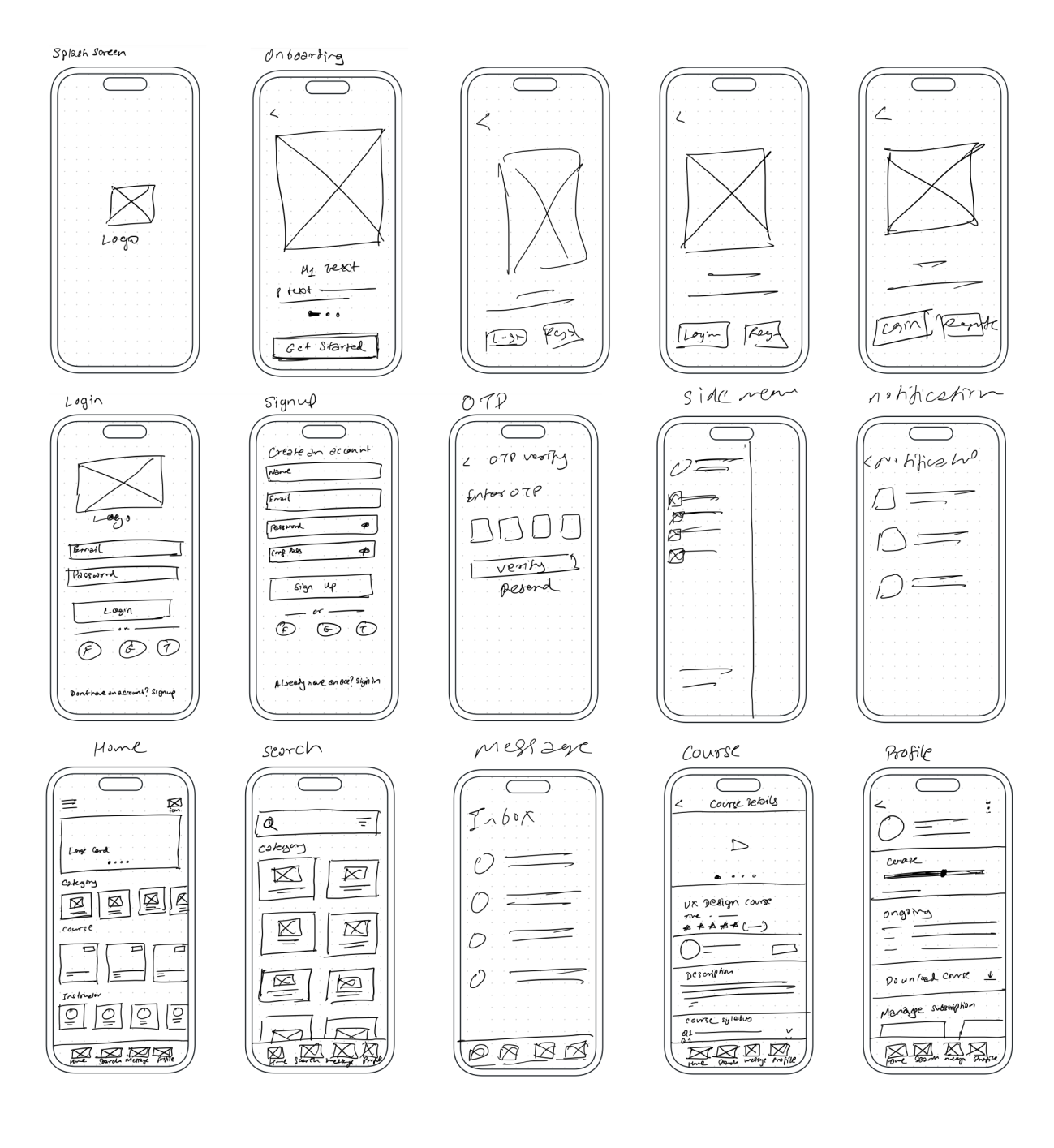
Through a series of sketches and multiple rounds of refinement, I used the simplicity and versatility of this medium to visually convey ideas, explore various design possibilities, and guide the project's evolution.
I aimed to create a practical and visual representation of the user-centered solutions I had identified, allowing for a more immersive exploration of the design's functionality and user experience.
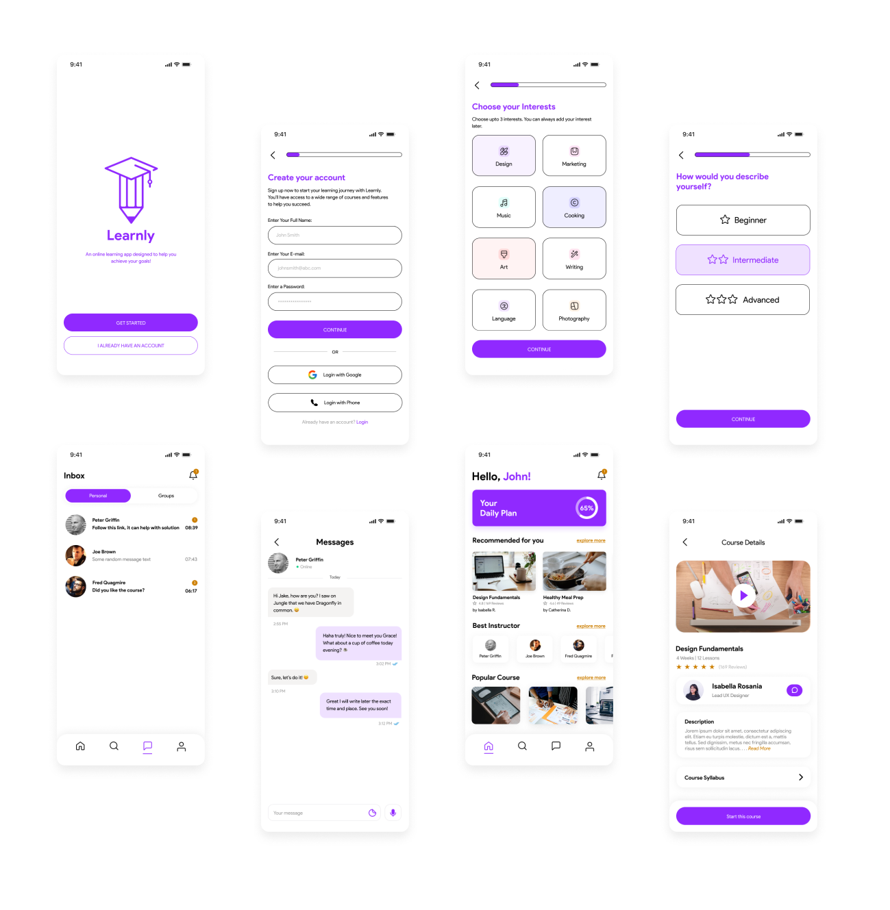
In response to user needs, I planned to improve the app by implementing a good recommendation home page, introducing a rewards system for motivation, fostering a strong user community and direct professor interaction. I have also added possible monetization strategy to meet business goals because design can not exist without business!
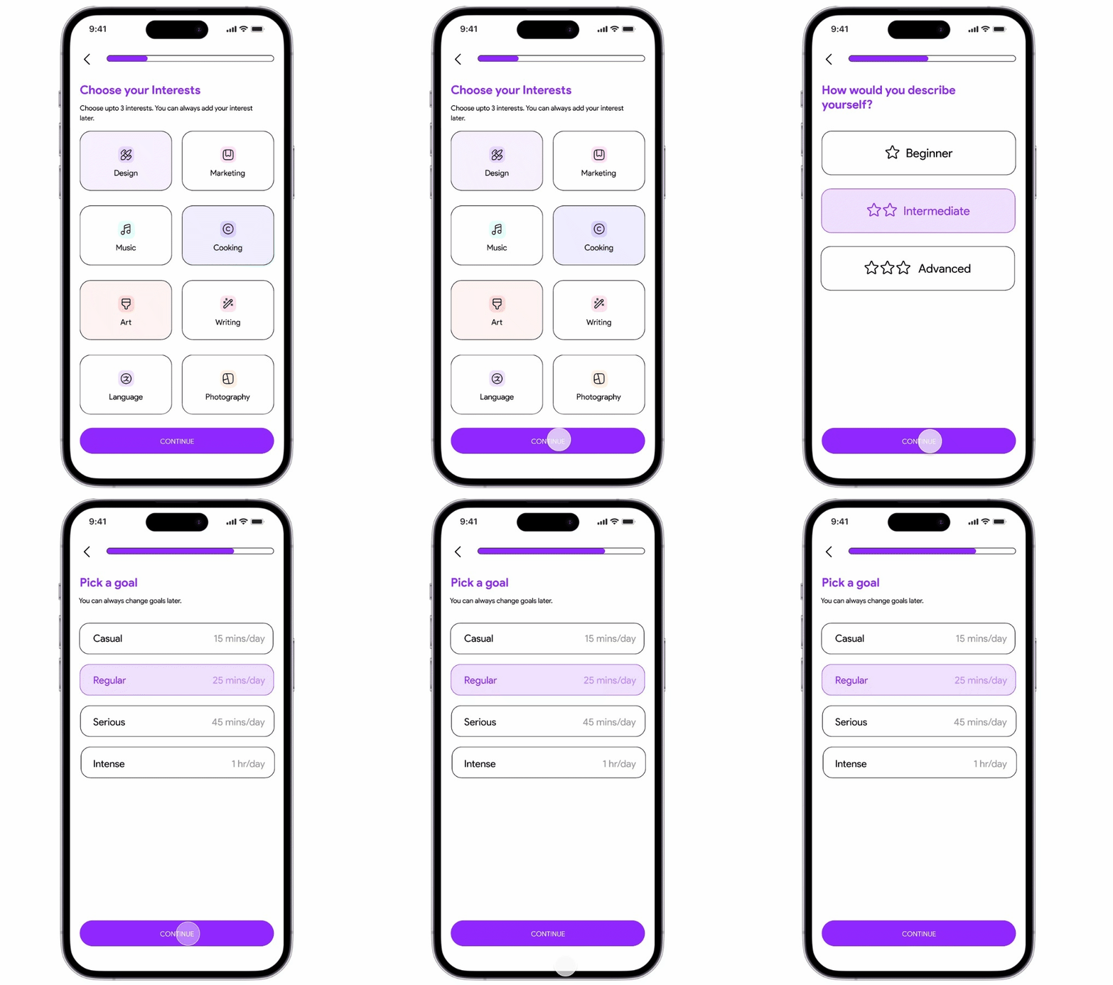
Implemented an improved onboarding process to gather user preferences for more accurate and personalized course recommendations on the home screen. This enhances the user experience by providing relevant content right from the start.
Enabling users to initiate direct communication with course instructors or professors within the app. This feature fosters a more supportive learning environment and allows students to seek guidance and clarification when needed.
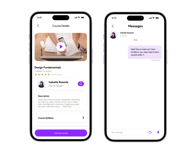
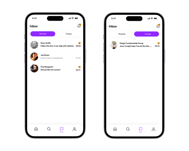
Upon enrolling in a course, automatically add users to a dedicated group chat with others taking the same course. This encourages peer interaction, collaboration, and the exchange of ideas, addressing feelings of isolation and enhancing the learning experience.
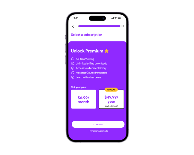
Premium benefits include ad-free viewing, access to the complete course library, the ability to message instructors, the inclusion in course-based groups, and the option to download content for offline viewing.
This monetization strategy supports the sustainability of the platform while providing users with added value.
I decided to test my prototype with 12 users. I developed a test plan, recruited participants, and then analyzed my findings.
To test the effectiveness of the feature with the target audience
To find potential usability issues
Collect qualitative and quantitative data and determine the participant’s satisfaction with the product
participants completed the task without any interference
participants agreed that these features will help and motivate them to complete online courses
participants did not find the features useful
There is still a lot more to explore (can be future scope) some of them are:
Targetted Notifications: I really like how Duolingo uses push notifications to come back to app and finish the set deadline language lessons, similar can be done to this app where we can send notifications to bring back users.
Gamification Elements: The app can be implemented with more game-like features, such as leaderboards, badges, and rewards, to increase user engagement and motivation.
Personalized Recommendations: The app could use machine learning algorithms to suggest courses and learning materials based on a user's interests, previous activity, and progress.