
In recent months Twitter (now known as X) has gone through a massive upheaval—the company was sold, executives have left, teams are being laid off, and the stability, and future direction, of the platform is unclear.
This presents an opportunity for other platforms (like Amazon) to enter the space, and snatch up Twitter users.
Note: This project was done as a concept, I was not associated with Amazon nor Twitter during it’s course.
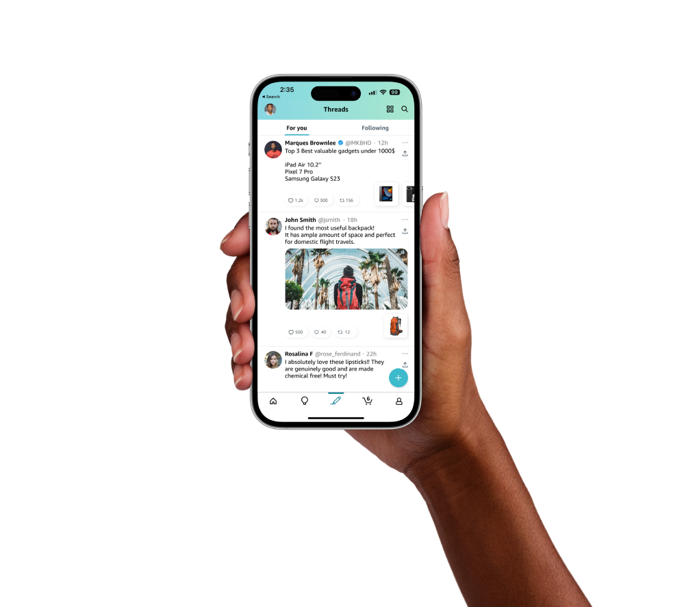
Solo Project
Figma, Figjam, Google Docs
1 week
In this project, I conducting research on the UIs of both Twitter and Amazon app. I focused on identifying potential features that could be implemented in Amazon's apps to attract and engage Twitter users.
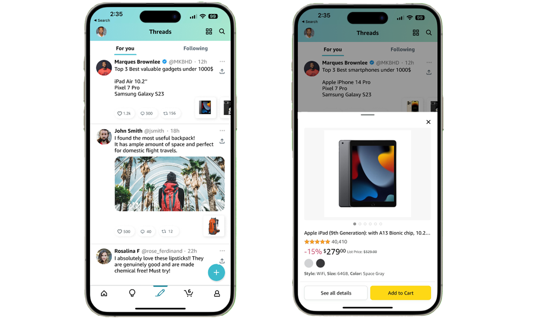
In a design sprint project conducted independently, I researched Twitter's upheaval and identified opportunities for Amazon.
Solution: The solution involved integrating Twitter-like features into Amazon's apps. Amazon already has Instagram reels/TikTok like features in its app. I came up with similar solution to give a separate bottom nav tab for tweeting while linking Amazon products on the tweet. I then created prototypes and conducted usability testing with several users and iterated based on feedback.
Result: Following usability testing, the project provided a compelling concept for Amazon to enhance its apps with Twitter-like features, showcasing potential enhancements in user engagement, retention, and platform competitiveness within a dynamic market
Learnings: This project not only proposed a practical solution but also imparted valuable insights into the iterative design and user testing processes, showcasing how Amazon could seize an advantage in the evolving social media landscape.
The problem we are trying to solve in this case is the current upheaval and uncertainty surrounding Twitter, which presents an opportunity for other platforms to enter the space and capture Twitter's user base.
To capitalize on this opportunity, there is a need to design and implement features that mimic Twitter's functionality, while ensuring that they fit seamlessly into the existing UX of the Amazon app without causing confusion or disruption.
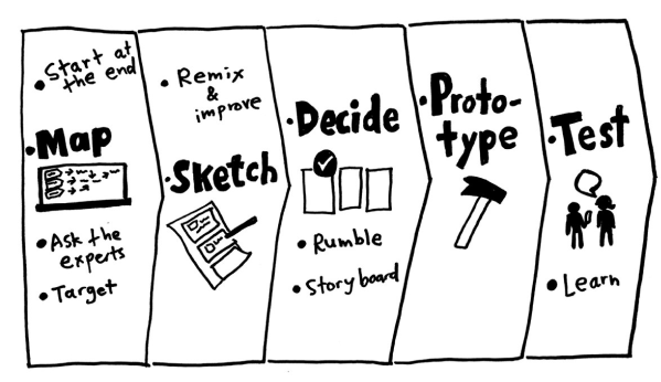
Using Google's 5 Day design sprint challenge answering critical business questions through design, prototyping, and testing ideas with real end users.
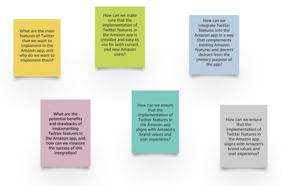
A list of questions arises about the problem. What are the first things that come to mind? Listing them here.
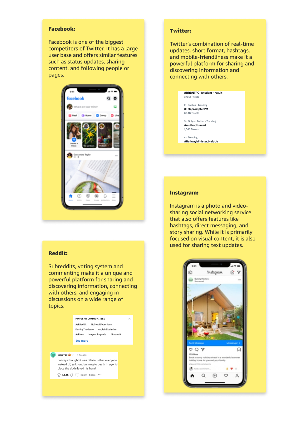
Searching similar products looking for similar ideas. Twitter is an obvious starting point, but other apps have similar feature sets.
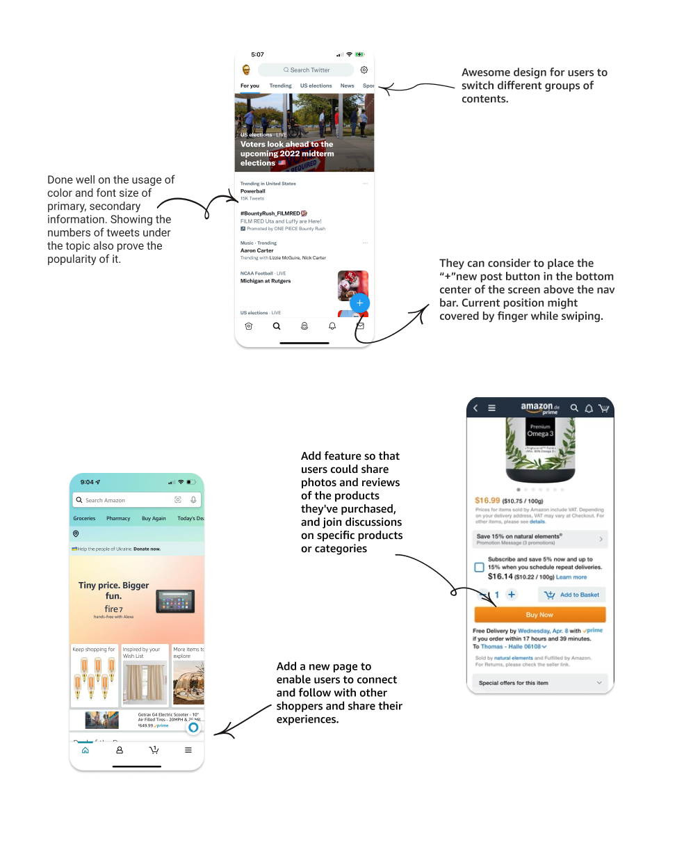
What language do these organizations use? What UIs work well?
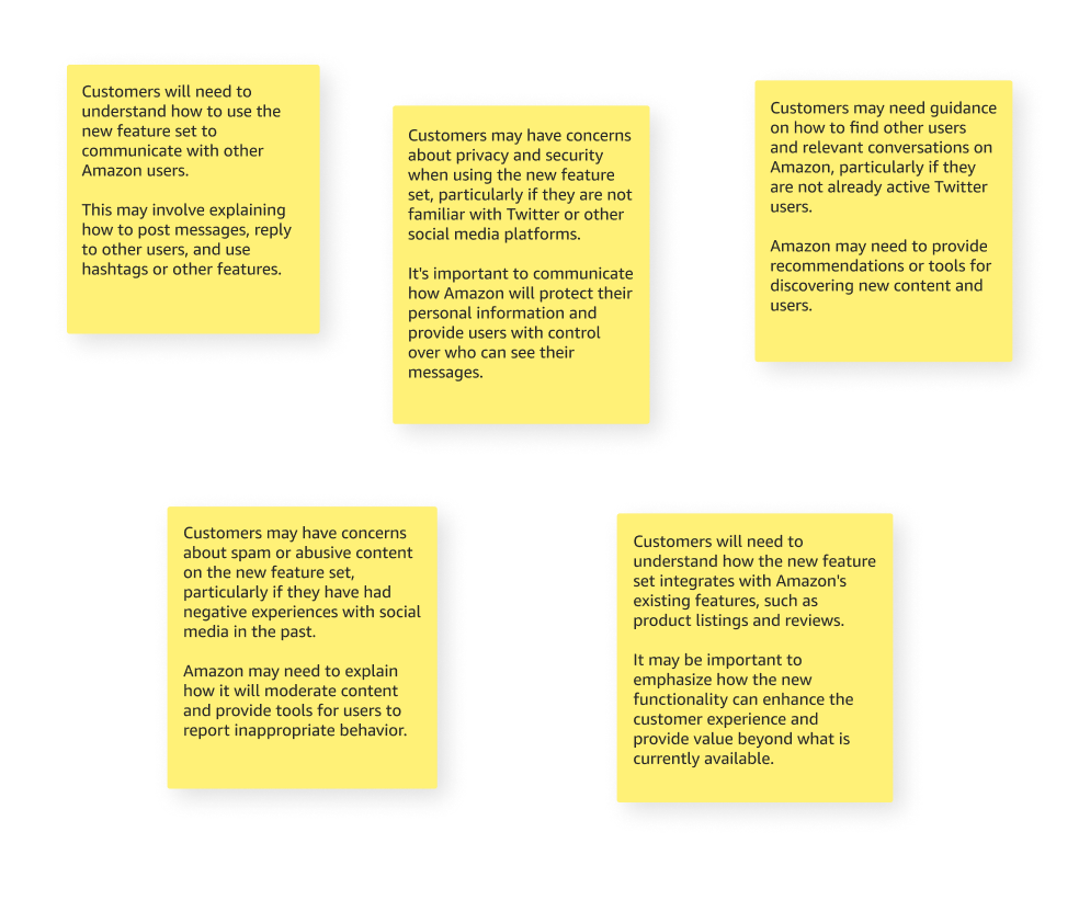
Listing the needs and prioritizing them.
Adding Twitter like functionality to Amazon introduces a very new paradigm. What customers will need to know about the new feature set? What concerns might they have?
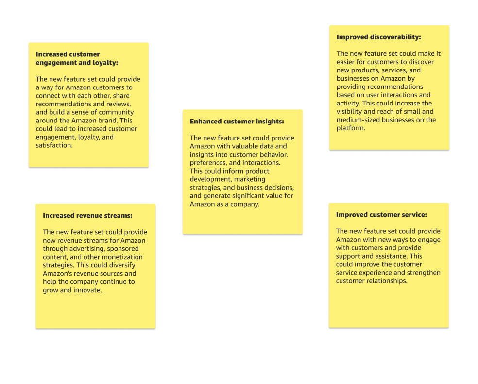
Listing potential good outcomes here.
Listing potential bad outcomes here.
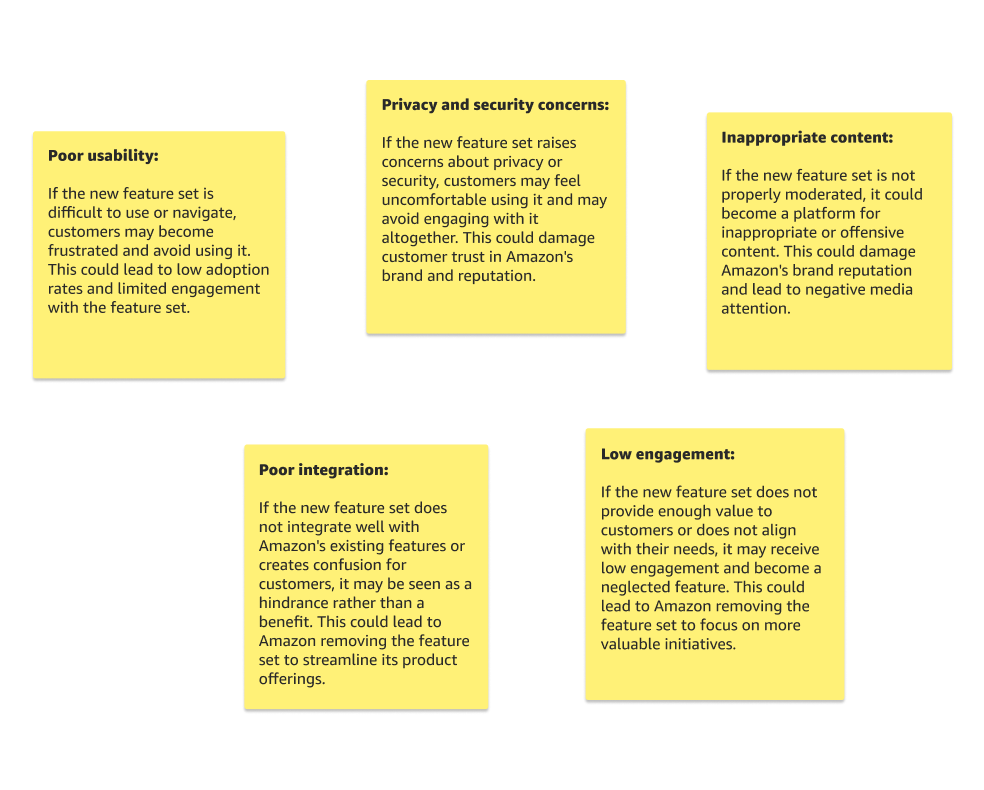
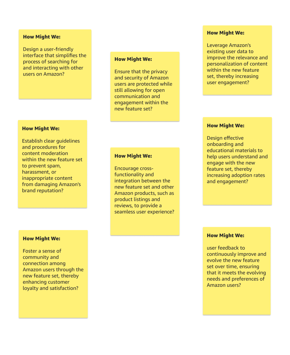
Listing how might we.
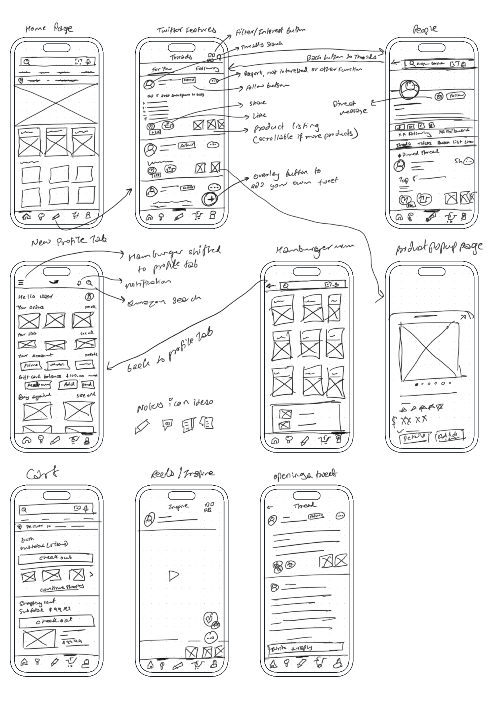
I made some intial hand sketches based on sprint question and tried to implement the basic flow
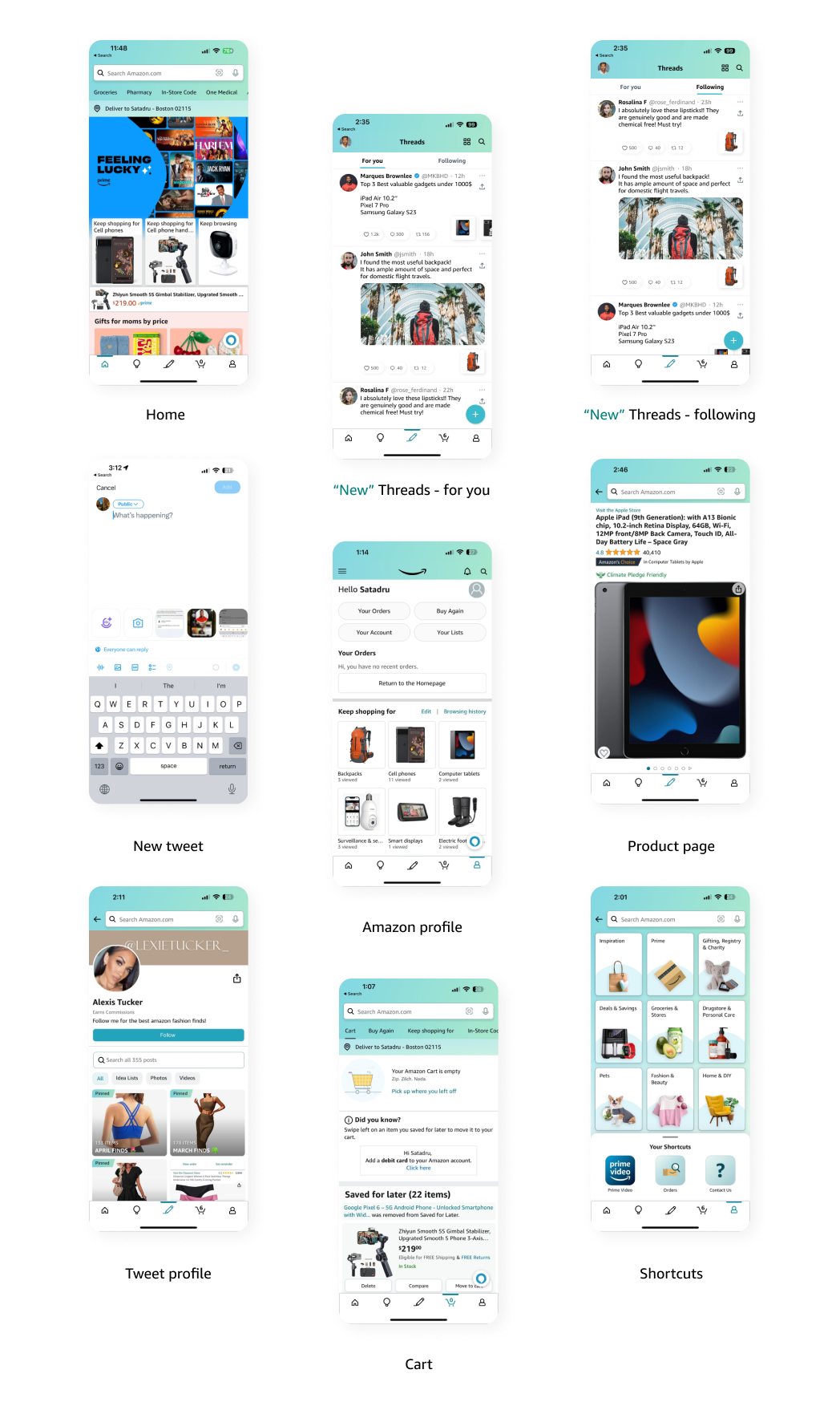
I then created High fidelity Screens and prototyped my concept using Figma
To evaluate the usability of Twitter-like features implemented in the Amazon app and identify any issues or areas for improvement. I decided to test my prototype with 10 users who use Twitter at least once a week and have made a purchase on Amazon in the past six months.
Write a new tweet.
Find and comment on an existing tweet.
Find a product listing in a tweet and explore it.
90% of the participants completed the task without any interference
95% of the participants were curious and found it interesting to have tweet features inside Amazon app.
10% of the participants confused writing a new tweet, as they were not used to doing so in the Amazon app
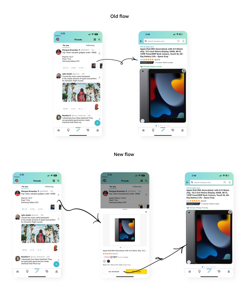
Difficulty navigating between a product listing and tweet within the Amazon app.
As we seen in Usability test results show that participants were generally able to complete the tasks, but some tasks took longer to complete than others.
One of the tasks was to interact with products listed in the tweet.
Some participants found it difficult to navigate back to the original tweet.
So to improve, I added a new pop up in between so if the user really wants to check out more details of the product, they can do that so.
I understood importance of adaptability in the tech industry, emphasizing the need for companies to pivot and seize opportunities in rapidly changing markets.
I underscored the significance of user-centered design, iterative prototyping, and usability testing, illustrating how these processes are integral to improving the user experience.
The case study also revealed the potential of strategic innovation by drawing lessons from Twitter's challenges to position Amazon favorably in the social media landscape.