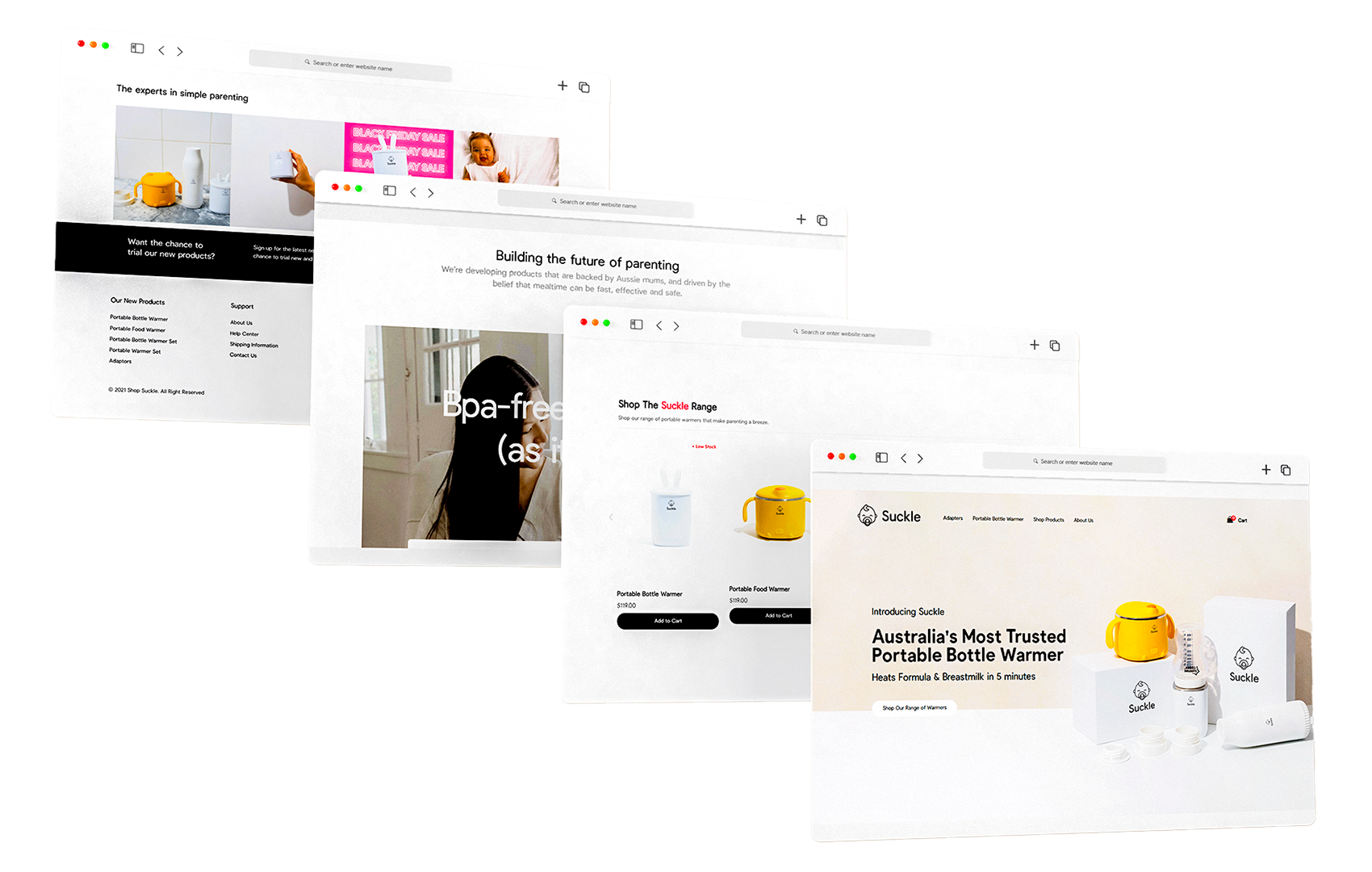
Suckle is a B2C startup selling portable bottle warmer and other products catering to parents with infants, offering a convenient and efficient solution for on-the-go feeding. I will explain how I optimized the cart checkout process to improve the sales and conversion rate.

1 Product Designer
1 Product Manager
2 Software Developers
1 Researcher
Figma, Adobe Creative Suite
Jan 2022 - Aug 2022
Product Designer, responsible for conceptualizing, designing, and implementing user-centric solutions.

I was tasked with crafting website for a startup that sells portable bottle warmers and other products for parents.
Problem: The startup had an unique product, which is very convenient for parents who travel with their babies.
However, the startup was facing a problem of low online sales, and they want to improve their website user experience to increase sales.
Real problem arised of data revealing high cart abandon rates while new user checking out.
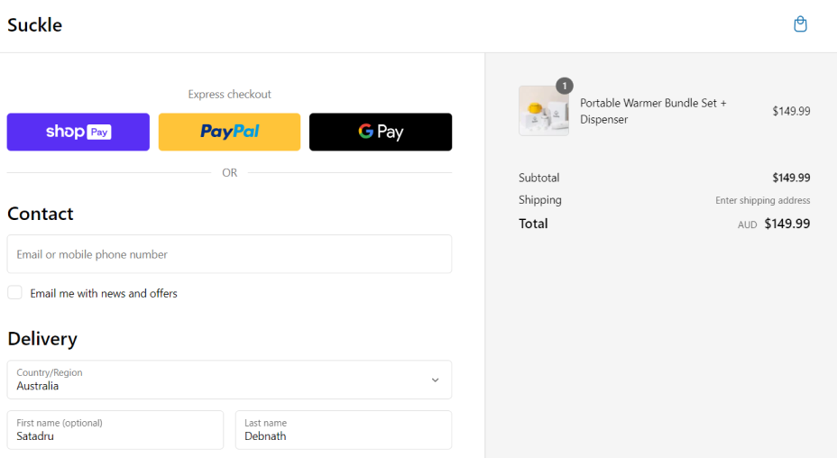
Solution: In order to boost the sales and have a higher conversion rate, we want the users to have a hasslefree experience from cart to checkout.
Solution was to identfying the friction points, getting rid of long checkout process and improving guest sign-up/log-in flow.
Results/Impact: 32% reduction in cart abandonment,
26% increase in sales
Designing a website for a startup selling portable bottle warmers was a challenging but rewarding experience. During the duration, I was able to focus closely on the needs of the user. Working closely with the cross-functional team, I was able to create an experience that was both visually appealing and highly functional. Here are some lesson which I learned:
Effective communication: This emerged as a linchpin of success within our cross-functional team. Daily interactions with Product Designers, Product Managers, Engineers, and Researchers highlighted the critical role of clear and concise communication. It was essential to ensure that everyone had a shared understanding of our project goals, timelines, and requirements. This skill not only prevented misunderstandings but also streamlined workflows and fostered a sense of unity among team members.
Value Feedback: I learned not only how to provide constructive feedback but also how to graciously receive it. Embracing feedback created a culture of continual improvement, enabling us to collectively refine our work. It made me realize that feedback is an invaluable tool for personal and professional growth.
Empathy: was another cornerstone of my internship. Understanding the perspectives and needs of our users allowed us to design products that genuinely met their requirements. This empathetic approach not only enhanced the quality of our designs but also underscored the significance of prioritizing the user experience in our work.